
Table of contents
In a previous article on calibrating your screen, we promised to look at the concept of gamma. It is a little-known concept, yet one that is essential for calibrating a screen.
Definition
To begin with, we’ll try to define gamma in the simplest possible way: “Gamma is a correction factor that allows you to adjust the contrast of an image in order to optimise how it appears on your screen.”
Genuine scientists will no doubt still spot some oversimplifications and inaccuracies here, but photographers – not all of whom are colour science experts – will surely find this useful. The aim here is not to do science, but to understand what actually happens in the real world.
Your eyes do not perceive light in the same way as the sensor in your digital camera. Our eyes correct brightness in a non-linear way.
Before we go into a bit more technical detail, here is a comparison between an image displayed with a gamma value of 1 (on the left) and one with a gamma value of 2.2 (on the right), which will help you immediately understand the purpose of this function.

The same image: on the left is a version with a gamma of 1.0, where you can see that many contrast values are invisible to us. On the right, however, you can see that the image correction with a gamma of 2.2 is much better, as confirmed by Wikipedia: “The best image rendering is not generally achieved with a linear transmission of luminance.“
Our eyes are better at detecting differences in the bright parts of an image than in the dark parts. Gamma is used to adjust the display contrast to suit our vision.
To make it even easier to understand, here are two greyscale ranges, from black to pure white: at the top, a range corrected with a gamma of 2.2, and at the bottom, a linear range (gamma of 1). You can see that the renderings are identical only for 100 per cent black and pure white.

You may also notice that:
- With a gamma of 2.2 at the top, the display shows a greater difference between 0.9 and 1.0 and a smaller difference between 0.0 and 0.1;
- With a gamma of 1 at the bottom, the opposite is true, as the display shows a small difference between 0.9 and 1.0, whilst the difference is greater between 0.0 and 0.1.
Our visual perception is not linear
Whilst photographers generally have an excellent perception of colours and shades, here is another very simple experiment you can try to understand that your visual perception is by no means linear.
When looking at a screen with a colour temperature of between 5,000 and 6,500 K, your eye will perceive a gamma of 2.2, whereas when reading a book, it will be closer to 1.8. In a cinema, it will be 2.6.
When you switch on the light in your bedroom in the middle of the night, you can clearly see the difference in brightness between the darkness and the light. But if you do the same thing in broad daylight, you won’t notice anything, or perhaps only a slight difference, even though the amount of light added is exactly the same. Our visual perception is gradual. Your eyes do not perceive an increase or decrease in light in the same way depending on whether you are in a dark or bright environment, which is why we recommend that you work in a room where the lighting is both low and consistent.
This non-linearity depends on your viewing environment: place two squares with two different shades of grey on a white background and the same squares on a black background. Your eye will perceive a greater difference in value against the white background, even though the values within the squares are exactly the same. The environment in which the colour is displayed affects your perception.

The role of the iris
Our eyes adapt to the amount of light in our surroundings by changing the size of the iris. You’ve all played this game when you were little: you look into each other’s eyes, switch off the light for thirty seconds, then switch it back on suddenly. At that moment, you can clearly see the other person’s iris constrict. The iris is a sort of diaphragm, like the one in your camera lens, which is constantly adjusting.
Your eye is capable of perceiving the equivalent of 24 f-stops, if we consider that your eye works a bit like a camera. But it can only see 14 at a time. Your camera, on the other hand, only has 13. It is your brain that recombines everything you perceive into a single image when you look at different areas, whether they are light or dark. Our eyes are capable of perceiving numerous details in the shadows without ‘blowing out’ the light colours, and conversely of perceiving all the details in the bright areas without ‘clipping’ the blacks. The eye outperforms any camera, including a Leica or a Hasselblad, whose cameras are fitted with sensors that are indeed exceptional – at equally exceptional prices.
So, the gamma of a screen is…
In summary, applying a non-linear characteristic to the display results in a higher-quality image, one that is more in line with human perception than with theory: with greater nuance in the highlights and slightly less in the shadows, where the eye is less sensitive.
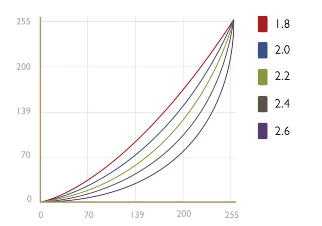
This graph illustrates the non-linear nature of colour display on a screen depending on the gamma value you have chosen. The difference between the original image (your file) and the displayed image (modified by the gamma factor) is all the greater in the middle of the curve the higher the gamma factor is. A black line at a 45° angle would represent a gamma of 1.
To adjust the gamma of your screen, please refer to our article on setting up the Color Checker Studio spectrophotometer:
https://rapido-books.com/how-to-calibrate-your-monitor-with-the-calibrite-colorchecker-studio/
If you’d like to find out more, take a look at this useful article by clicking on the link:
https://www.cambridgeincolour.com/tutorials/gamma-correction.htm

Simon Dulac
Founder & CEO of Rapido Books


